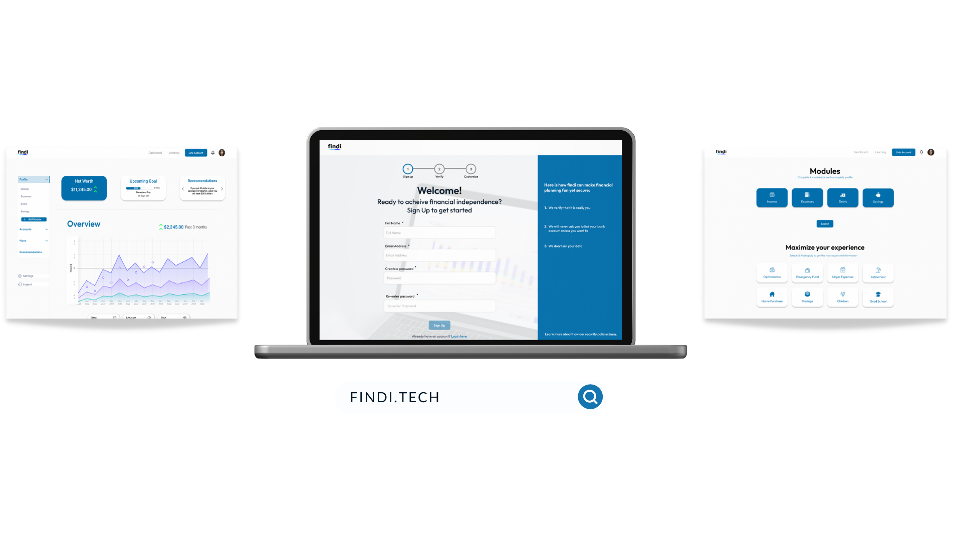
Project Context
Objective: To design an onboarding and dashboard experience that helps customers feel comfortable, informed, and oriented about their finances and that is in brand with Findi’s mission statement.
Outcome: An improved onboarding and dashboard experience for the web platform increased user confidence through user testing. Users showed decreased hesitancy while completing tasks and expressed positive feelings about the improved functionalities and appearance.
-
Timeline
May - June 2022 (3 weeks)
-
My Role
UX Researcher & Project Manager
-
Tools Used
Figma, Miro, Notion, Canva, Google Suite
-
My Contributions
Project plan, User interviews, Usability testing, Research synthesis, Design Studio, User persona, Wireframes, Prototype, Presentation
Discover
User Research
Our research goal was to discover how people go about planning their finances and any problems or frustrations they experience while doing so, and how we could optimize our web application to solve these problems. Our target audience was tech-savvy adults between the ages of 20-40 who are just starting to plan out their finances.
Research methods: Screener survey, User interviews, Task Analysis, and Competitor research.
User Interviews
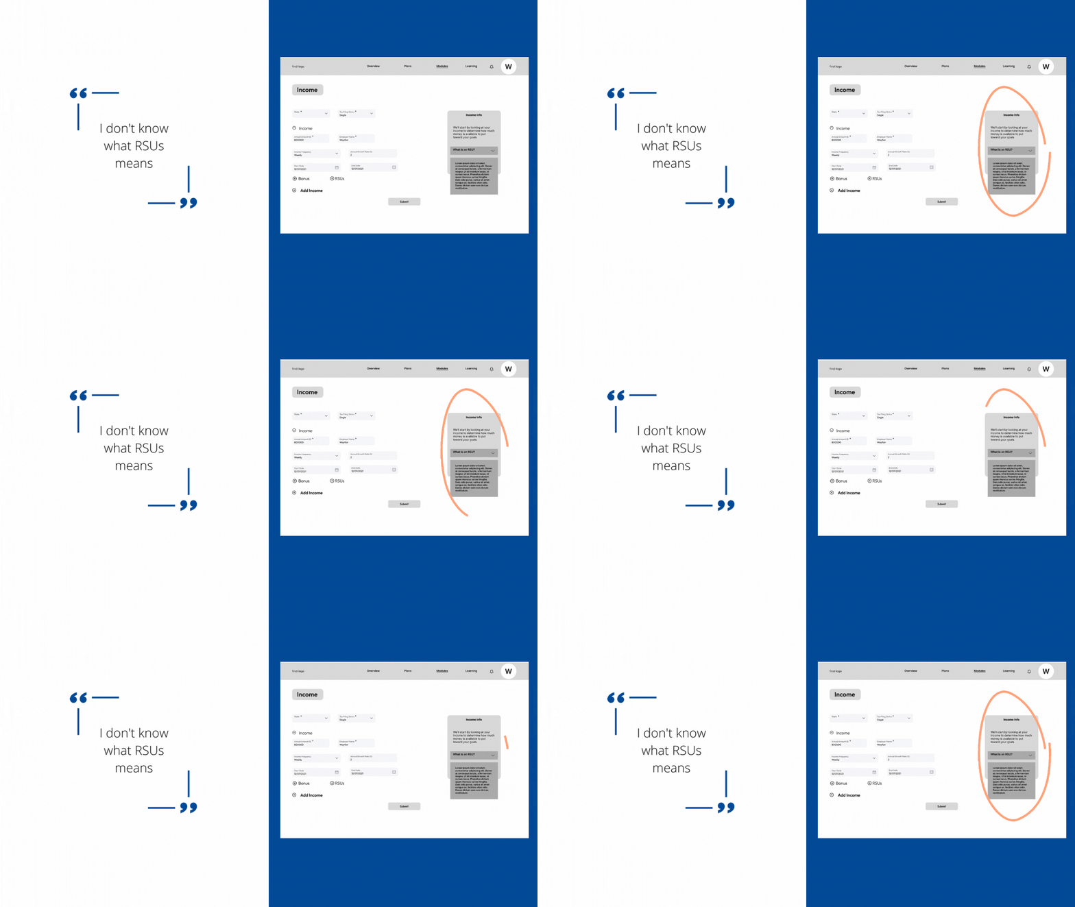
The following quotes from the user interviews helped us conclude that people value financial literacy and security when it comes to their finances, and they want the management of their finances to be simple and effortless.
Affinity Mapping
We arranged the insights from our interviews onto post-its on Miro to group them into categories or “I” statements. These are the “I” statements that guided our ideation:
User Personas
Based on the observation from our user interviews and affinity mapping, we then created this persona for our user. Meet Wary Wendy:
Task Analysis Testing
We gave four people the task of signing up and navigating the platform as new users. This information is summarized in the following map of Wendy’s journey using the platform.
Define
Problem Statement
Once we had uncovered the trends from our user research, we put together this problem statement.
Young adults need an effortless way to build confidence in their financial literacy in order to feel secure in their approach to quickly organizing their finances.
How Might We…
Specifically, we wanted to solve these questions:
How might we help users build up their financial literacy?
How might we encourage repeated engagement from users?
How might we help users to be organized with their finances?
How might we ensure users that their information will be secure?
Ideate
Sketching
After deciding on our problem statement, we then moved on to having a design studio session where we all worked to create sketches of what the platform should look like.
This is the user flow we followed to create the screens.
After going through everyone’s sketches, we then collaborated to draw out a rough version of the final flow using Miro.
Low-Fidelity Wireframes
Next, we worked together to translate the sketches into wireframes. After deciding on the basic look of the wireframes, we split up the task of making the screens. I made the first few screens, while my other teammates split up the rest of them.
During the onboarding, we solved the problem of security concerns by adding a section which informs the user of how their information will be protected, as well as a security code screen for added protection.
During the phase where the user enters their financial information, we help them feel more informed and confident about filling out their information by providing a side-box with explanations for terms the user does not understand.
Test
Usability Testing
After completing the low-fidelity wireframes, we then did some more usability testing to see what worked and what did not. This was the test plan we wrote up:
Situation: You are a college grad three years into your work experience. You are now trying to get on track with your finances and find the findi website.
Tasks:
Sign up, add your source of income, and look at your net worth
Find modules and complete the income module
View the dashboard and find your net-worth
Add more modules to the dashboard
These are the things we observed during the usability testing.
The left side shows the low-fidelity version of the wireframes, while the right side shows the high-fidelity version that we made after usability testing.
Final Prototype
For the last week of the project, we worked on making the low-fidelity wireframes into high-fidelity based on the results of our usability testing. We also consulted with our client to ensure we were going in the right direction and that it would be possible for them to implement the changes we were making to their website.
Here is a video walkthrough of the final prototype. The button below leads to the interactive prototype on Figma.
Conclusion
Next Steps
From here, we handed off the prototype to the client was pretty happy with the results. The next steps we could take from here would be:
To build out the learning section of the platform.
To work more on the UX copy because that is essential to building trust
To build a mobile version of the platform since most of our users expressed that they prefer managing their finances on mobile.
After our final presentation, the client was eager to develop our designs. They considered our suggested next steps and started looking into securing funding and incorporating these ideas.
Retrospective
This project was a bit of a learning curve. Trying to incorporate both the client’s wishes and the user’s needs into our designs took a bit of trial and error and a lot of back-and-forth communication. Usability and A/B testing proved the most valuable in giving us direction for the design and proving to the client which design elements delivered the best user outcomes. Overall, it was a great experience learning how to communicate with stakeholders and design with both business goals and user needs in mind.


